Post modernism has no real definition because it is still an on-going development but I will explore what post modernism is and how it is used in the media which we are exposed to on a daily basis.
Wednesday, 2 May 2012

Sunday, 22 April 2012
The context of my film was to produce a short sequence with the narrative of a Horror film. The sequence created meaning to the audience and I did this by using different stylistics of a horror film such a cinematography, mise en scene, editing and sound. By creating meaning to the film it allows the audience to understand and allow them to develop a personal and emotional response to the film, this was my main aim. This meant that my audience needed to be an active audience.
One of the four stylistics I used in my sequence was cinematography. Cinematography helped create meaning to the audience by the use of camera movement and shots I used many high angled shots such as shots 2, 3, 4, 6, 21, 25. High angled shots create a feeling of vulnerability; this was used mostly on the characters that were to become the victims. Long shots were used to allow the audience to be able to see fully what was going on in the shot and to be able to take in the full picture. Long shots can be seen in shots 1,2,15,16,23,24,25 and 26. I used mostly Medium close up shots with the exception of some close up shots, these allowed me to convey the characters emotions to the audience, these shots can be seen in 3,4,5,6,7,8,11,12,1314,17,19,20,21. Close ups and extreme close ups were used to create a dramatic and emotional response with the audience, these can be seen in shots 10 and 18.
Sound was important in the sequence to allow the audience to understand there has been a change in the equilibrium of the film. The use of conventional horror sounds were incorporated into my sequence. I used many Dietetic noises as I wanted it to seem as realistic as possible. Dialogue allowed the charectors to express there emotions and to add significant meaning to the narratitve such as the strangulation scenes of both Lynne and Peter to the scene were Doreen is shouting "Brains" this is typical of dialogue from Horror films.
Editing was used to keep the pace of the film constant. I used various diffrent editing techniques. for example I used Jump cuts to quickly move into the next shot. These were used to let the audience know that something is happening that is of high significance such a death or a build up to a scene. Disolves were used for slow scenes such as the build up to Peters scene in the beggining. also it showed that time had passed such as the change between the sleeping scene to waking up and leaving the house to go to the Public place.
Wednesday, 18 April 2012
Evaluatuion for Film 750- 825 words
The context of my film was to produce a short sequence with the narrative of a Horror film. The sequence created meaning to the audience and I did this by using different stylistics of a horror film such a cinematography, mise en scene, editing and sound. By creating meaning to the film it allowed the audience to understand and allow them to develop a personal and emotional response to the film, this was my main aim. This meant that my audience needed to be an active audience.
One of the four stylistics I used in my sequence was cinematography. Cinematography helped create meaning to the audience by the use of camera movement and shots I used many high angled shots such as shots 2, 3, 4, 6, 21, 25. High angled shots create a feeling of vulnerability; this was used mostly on the characters that were to become the victims. Long shots were used to allow the audience to be able to see fully what was going on in the shot and to be able to take in the full picture. Long shots can be seen in shots 1,2,15,16,23,24,25 and 26. I used mostly Medium close up shots with the exception of some close up shots, these allowed me to convey the characters emotions to the audience, these shots can be seen in 3,4,5,6,7,8,11,12,1314,17,19,20,21. Close ups and extreme close ups were used to create a dramatic and emotional response with the audience, these can be seen in shots 10 and 18. Sound was important in the sequence to allow the audience to understand there has been a change in the equilibrium of the film. The use of conventional horror sounds were incorporated into my sequence. I used many Dietetic noises and did not use many non diejetic noises as I wanted it to be as realistic as possible. Dialogue allowed the characters to express there emotions and to add significant meaning to the narrative such as the strangulation scenes of both Lynne and Peter to the scene were Doreen is shouting "Brains" this is typical of dialogue from Horror films. Editing was used to keep the pace of the film constant. I used various diff rent editing techniques. for example I used Jump cuts to quickly move into the next shot. These were used to let the audience know that something is happening that is of high significance such a death or a build up to a scene. Dissolves were used for slow scenes such as the build up to Peters scene in the beginning. also it showed that time had passed such as the change between the sleeping scene to waking up and leaving the house to go to the Public place. Mise en scene was probably the most important and biggest stylistic I used to incorporate my narrative within the sequence. Location is very important when it comes to a horror film so I choose two very contrasting locations, from a vulnerable old peoples living room to a large public place with large masses, Large masses are often used within a horror film to show the amount of people that could be effected. The use of props was extremely important in the sequence. as the medicine was the catalyst to the changing to the equilibrium. The clock was also used to symbolise time going by. Performance and acting was key to building an emotional response from the audience, the use of shock and fear from the characters can clearly be seen such as in shot 26. Lighting was consistent throughout the sequence and this is one thing that challenges and goes against the conventions of a horror film.
I got a small amount of audience feedback, I got both Positive and Negative reviews. Many people enjoyed the scene and everyone said they followed the sequence and understood what was going on. People said that the stylistics that I had used was well exhibited but one person said that I could of improved by being more in control of the lighting and props in the scenes. The majority of the people that saw my small sequence of images said that they would of loved to have seen it in motion picture and clearly created an emotional response. In my opinion I believe that I have achieved what I set out to do and that was to create and fearful and emotional response to the audience by using the 4 different stylistics and kept continuity running throughout the scene. but there are a few things that I would change. I would of taken more time to position my characters, I would of spent more time on lighting and I would of focused on placement of props. overall I believe I created a well laid out sequence that accomplishes its aims and context.
Monday, 19 December 2011
Evaluation
We were given a task to create the front page, contents and a double page spread for a new music magazine. The images and text used had to be original and produced by myself, and we were given a minimum of four images.
My media product uses and develops most forms and conventions of a real media product. This is done by placing things in a professional and conventional manner in which it fits in with the image of other well-known magazines. My front cover consists of an image, a masthead, price, barcode and other things you would expect to find on other magazines. It sticks with most of the conventions that would be found on other magazines but has its own twist on it for example, it does not have the price where a normal magazine would place its price code, as mine is at the top right hand corner because with the audience’s own knowledge of magazines, people read from top left downwards and in this economic climate people want to know how much a magazine costs before they would think about purchasing it. The Mast head is very bold and eye catching using a bright colour so when the consumer sees the product they would be able to tell straight away that this was the title for my magazine. It also has a different font to it so it gives it a new and original effect. The title "WTFK" stands for "What’s The Frequency Kenneth." Other than it being my name it was a song from a band and I thought this gave its own character and edge to my magazine. The picture I used for my magazine was a picture of Connor who was the main artist in my magazine with a featured interview and was continued through my magazine on the front cover, contents page and double page spread. Connor is holding a guitar and is placed behind a set of drums, I did this during my photo shoot as I wanted to show that he is a musician and the audience would be able to see this straight away. The lighting is bright and shows Connor’s face well so then the audience will be able to be easily recognised. I did not want the audience’s eye to be distracted by puffs and advertisements that would be normally shown on a magazine but in my audience research people said they did not wanted to be bombarded by advertisements so I took this on board. When I was in my planning stage of creating my magazine I wanted to create meaning for my product so when it came to colours I wanted continuity in my colours and this is why I chose two contrasting and eye catching colours. Symbolically Black and Red mean danger but the colour Red can also be seen as the colour for passion and I picked up on this as my magazine is both appealing to both male and female niche audiences. I wanted my product to be cheap as these economic times have hit my target audience hard. Also I have put the date of issue so people know which edition they are buying. When I was at my photo shoot I intentionally set out that I wanted my artist to be looking at the camera for my front cover as I wanted the audience to be able to have that connection with my artist and also I knew that I would need to leave space for my Mast head and other conventions that I have included and positioned.
My media product uses and develops most forms and conventions of a real media product. This is done by placing things in a professional and conventional manner in which it fits in with the image of other well-known magazines. My front cover consists of an image, a masthead, price, barcode and other things you would expect to find on other magazines. It sticks with most of the conventions that would be found on other magazines but has its own twist on it for example, it does not have the price where a normal magazine would place its price code, as mine is at the top right hand corner because with the audience’s own knowledge of magazines, people read from top left downwards and in this economic climate people want to know how much a magazine costs before they would think about purchasing it. The Mast head is very bold and eye catching using a bright colour so when the consumer sees the product they would be able to tell straight away that this was the title for my magazine. It also has a different font to it so it gives it a new and original effect. The title "WTFK" stands for "What’s The Frequency Kenneth." Other than it being my name it was a song from a band and I thought this gave its own character and edge to my magazine. The picture I used for my magazine was a picture of Connor who was the main artist in my magazine with a featured interview and was continued through my magazine on the front cover, contents page and double page spread. Connor is holding a guitar and is placed behind a set of drums, I did this during my photo shoot as I wanted to show that he is a musician and the audience would be able to see this straight away. The lighting is bright and shows Connor’s face well so then the audience will be able to be easily recognised. I did not want the audience’s eye to be distracted by puffs and advertisements that would be normally shown on a magazine but in my audience research people said they did not wanted to be bombarded by advertisements so I took this on board. When I was in my planning stage of creating my magazine I wanted to create meaning for my product so when it came to colours I wanted continuity in my colours and this is why I chose two contrasting and eye catching colours. Symbolically Black and Red mean danger but the colour Red can also be seen as the colour for passion and I picked up on this as my magazine is both appealing to both male and female niche audiences. I wanted my product to be cheap as these economic times have hit my target audience hard. Also I have put the date of issue so people know which edition they are buying. When I was at my photo shoot I intentionally set out that I wanted my artist to be looking at the camera for my front cover as I wanted the audience to be able to have that connection with my artist and also I knew that I would need to leave space for my Mast head and other conventions that I have included and positioned.
My Contents page also has the normal conventions of a regular contents page but is different and unique to its rival magazines which are at competition with each other. It has the name of the magazine at the top so then it reminds the audience all the way though that you are reading something from WTFK. This is due to my plan for having continuity throughout the magazine. It has the Masthead stating "Contents." This helps people know that it is the contents page and also I used a large red font so it stands out from everything else other than the WTFK which needs to be larger as it is more important. There is an Editors letter on my contents page which is usually seen in other successful magazines. It also does not take up a lot of room but is visible to the reader and they will automatically know that the article is an editor’s letter because other magazines place there editors message in the same place as were I positioned my editors message. She talks about the main artist in the magazine which is Connor and she talks about how she enjoys his music and also has a friendly and approving approach to Connor and his music, this could be used to help Connor gain popularity and also the reader will be able see that if the editor is writing about him that he must be good. There is also a picture to the left of the Editors letter and it shows a coloured close up shot of Emily who is the editor of the magazine and who had wrote the editor’s letter the left of the Editors letter. This also helps the reader to put a face to the editor so then people feel as though they have that sense of communication between the Editor and reader. The list of pages is featured into two different categories being "Featured pages" and the other being "Regulars" this lets the audience know who is usually in the magazine and who is a special feature and this would make the audience want to know what it is. Also the colour used changes between the both and is reversed to give the opposite affect to each other. The picture I used for my Contents page was a picture i took in the Piano room in college which was a well lit room and was facing away from the window so then it would give it a really inspiring look to it. The picture shows Connor playing the Piano as he is bent down and really feeling the music. I cropped the photo so then you would only really see Connor and the piano, this created meaning to the reader and shows the intimate moment of Connor and the Piano, I also took pictures of another artist so my contents page would look fuller and more professional as people do not want a magazine just to consist of one artist so with having another artist appear in the Contents page it looks like there is more than one artist in the magazine, The photo is natural and shows Faran holding a guitar, this showing that she is musical talent and that she will also be in the magazine. I positioned my Contents page in a specific way which stuck by the conventions of a normal magazines contents page, I wanted it to be simple so the reader will easily be able to understand it and also look professional and unique.
My Double page spread also has the characteristics of a well-known magazine because the layout is similar to other magazines and also there is a clear divide down the page. On the left page you see is dominated by the photo and also the name of the artist "Connor Hodgins”. This allows people to know that it is the article that had been advertised on the front cover and on the contents page. The photo is a dark photo but a powerful photo to use because it shows Connor working on a Sound system, when I was planning for my shoot I wanted somewhere where they use digital sound systems so when I went to go and view the shooting area I straight way knew that the studio would be great for my shoot. It was in a dark room but this showing that this is was all the music is created and how he puts all of his knowledge and energy into editing and creating his songs. The photo also goes along with the caption which says “Behind the Desk with Connor” this connotes the fact that you are seeing a side to Connor which most people do not usually see an artist when they are producing the music so this could start to build up a relationship between the reader and artist. There is an introduction to the interview at the right side of the double page spread masthead and there is a quote from the interview, big music magazine companies use quotes because it has catches the eye of the reader and also allows them to see what he will be talking about in the article because when it says "I'M ENJOYINGALL THE ATTENTION FROM THE GIRLS" I used this quote because the target audience of m magazine is teens and I target my magazine at having a 50/50% male and female to I targeted into the Narcism because boys would want to be him and girls would want to be with him, also it has a cheeky element to it. On the right hand of the page is the actual interview and two headings. The first heading says "Behind the desk with Connor" this has two meanings to it and how it is interpreted by the reader because when creating a magazine it is all about creating meaning. If you look at the photo you are behind the desk looking at Connor and also this can related to finding out a bit about Connor and finding out what happens behind that desk. The interview is laid out in columns so it looks professional and also in order, this helps the reader to read the article and be able to see who is asking the questions. I wanted the interview to have an informal and a friendlier approach to the interview so Connor would be able to seem as though a funny, cheeky and sociable character. There also is a caption at the bottom of the double page spread saying what the double page spread is about. The double page spread is also set out in the normal format for a double page.
My Double page spread also has the characteristics of a well-known magazine because the layout is similar to other magazines and also there is a clear divide down the page. On the left page you see is dominated by the photo and also the name of the artist "Connor Hodgins”. This allows people to know that it is the article that had been advertised on the front cover and on the contents page. The photo is a dark photo but a powerful photo to use because it shows Connor working on a Sound system, when I was planning for my shoot I wanted somewhere where they use digital sound systems so when I went to go and view the shooting area I straight way knew that the studio would be great for my shoot. It was in a dark room but this showing that this is was all the music is created and how he puts all of his knowledge and energy into editing and creating his songs. The photo also goes along with the caption which says “Behind the Desk with Connor” this connotes the fact that you are seeing a side to Connor which most people do not usually see an artist when they are producing the music so this could start to build up a relationship between the reader and artist. There is an introduction to the interview at the right side of the double page spread masthead and there is a quote from the interview, big music magazine companies use quotes because it has catches the eye of the reader and also allows them to see what he will be talking about in the article because when it says "I'M ENJOYING
Producing this magazine has developed my knowledge of both the practical and creative side of Media. I have gained valuable knowledge about how to produce and create a magazine and also learn a lot of terminology about Media which I did not know about before creating the magazine. Though the use of different forms of digital technology. The different forms of digital technology that I used to create my Magazine were Blogger, cameras and Photoshop. Using these I could produce and develop my skills in many ways such as, how to use these forms of digital technologies and how to use them in a constructive and productive way to produce my final products. Blogger was the first thing I was introduced to. It allowed me to put all of my ideas, Planning, essays, photos, videos, scanning work and final products onto the blog. Blogger enabled to put all my ideas together and to make a final decision on what I wanted to do. It allowed me to look back and piece together all of the posts that I made to produce and piece everything together. Blogger helped me develop my skills on how to structure, clearly show my workings out and show it all in chronological order. When I took my photos I could easily upload my photos onto the blog and analyse each photo and write a descriptive analyse of each photo below the photo. It was also good for when I needed to upload videos to do the LIIAR analysis. Blogger allows you to upload photos so this allowed me to scan things into the computer then publish them onto my blog. Blogger helped me develop my skills and by the end of the year I was confident about using Blogger and knew how to work it and structure my work clearly.
To make the magazines we needed photos and to take the photos we used the Vivitar 8 megapixel cameras. Using the camera was quite difficult at first but I soon learnt how to use it. It took me a couple of photos to get the pictures I wanted and learnt different techniques on how to take the photo. I learnt how to change the camera settings to make the camera turn black and white to very colourful. Shooting was very easy and different kind of shots gave the photos different affects such as tilting the camera slightly to create an edge of uneasiness and disorientation. After taking the photos I then uploaded them onto my blog and then could start to Photoshop them. Photoshop was a great help and allowed me to make my pictures better and edit things out that I don't want in my picture such as red eyes, Backgrounds and also things that did not fit in the scene. Once I had gotten rid of everything in the photo that I did not want, I then went on to add things to the photo which I though was appropriate such as extra lighting or making the scene darker. After making changes to the photos I then could develop my skills that I had learnt in class and though demonstrations by the teachers to start to construct my magazine. From using the scanner I knew exactly where I wanted things to go in my magazine so I knew what parts of my picture would be covered. Most of my pictures were quite central so I did not have this problem. I then could edit in backgrounds and effects to the magazine. I used the codes of conventions in my magazine so this had an effect on my decision making because I needed to my magazine not to look identical but have the similarities of other magazines such as a front cover with a Masthead. All the way though producing my magazine I had to think of how the use of Digital technologies could help me with my decision making as I knew that I could always improve on my work with the skills I had learnt with Blogger, cameras and Photoshop. Overall I am happy with the final product and looking back throughout my posts and my work I have seen clear signs of progress and feel more confident about using different forms of digital technology and know-how using it will help to create a better product.
To make the magazines we needed photos and to take the photos we used the Vivitar 8 megapixel cameras. Using the camera was quite difficult at first but I soon learnt how to use it. It took me a couple of photos to get the pictures I wanted and learnt different techniques on how to take the photo. I learnt how to change the camera settings to make the camera turn black and white to very colourful. Shooting was very easy and different kind of shots gave the photos different affects such as tilting the camera slightly to create an edge of uneasiness and disorientation. After taking the photos I then uploaded them onto my blog and then could start to Photoshop them. Photoshop was a great help and allowed me to make my pictures better and edit things out that I don't want in my picture such as red eyes, Backgrounds and also things that did not fit in the scene. Once I had gotten rid of everything in the photo that I did not want, I then went on to add things to the photo which I though was appropriate such as extra lighting or making the scene darker. After making changes to the photos I then could develop my skills that I had learnt in class and though demonstrations by the teachers to start to construct my magazine. From using the scanner I knew exactly where I wanted things to go in my magazine so I knew what parts of my picture would be covered. Most of my pictures were quite central so I did not have this problem. I then could edit in backgrounds and effects to the magazine. I used the codes of conventions in my magazine so this had an effect on my decision making because I needed to my magazine not to look identical but have the similarities of other magazines such as a front cover with a Masthead. All the way though producing my magazine I had to think of how the use of Digital technologies could help me with my decision making as I knew that I could always improve on my work with the skills I had learnt with Blogger, cameras and Photoshop. Overall I am happy with the final product and looking back throughout my posts and my work I have seen clear signs of progress and feel more confident about using different forms of digital technology and know-how using it will help to create a better product.
Wednesday, 14 December 2011


Monday, 14 March 2011


Wednesday, 2 March 2011
Photo shoot pictures and analysis
The models I have used for my magazine is Connor Hodgins and Faran Parker, They were very Kean to be part of my Magazine and was very enthusiastic and natural at playing the instruments as they are both part of bands and play at gigs and venue across Yorkshire on a regular basis. The setting for this photoshoot was at a professional recording studio in the centre of town. These are the shots that I took on the photo shoot and I will be choosing which pictures I will choose and what photos I will not choose and give a reason why and were they will be placed in my magazine.

Photo 1
This photo is not a very good photo to use in a main shot for example my front cover because people would not be able to see the artists face. The staging is very good because of the drums being in the for ground. The lighting is bright and you can tell that he is playing the instrument. This photo would not be good for my magazine because there would be no room to fit any information in. Also the photo is squeezed.

Photo 2
This photo would be a good photo to use for a double page spread. This is because it is a wide shot. It would not be good because of the obstructions in this shot for example the microphones are obstructing the drums. Also this shot is a bad rule of 3rd because the at both sides there is unwanted space and also it is to far away from the camera it would of been better with more of a close up and zoom. Even though this photo would be used as a double page spread because of its side i would not use it because of the problems in it.

Photo 3
This photo is an action shot because of the movement seen in the picture. Connors face is blurred because i wanted to capture a shot where it looks like he is moving. I asked him to play the drums but also move his head from side to side quickly to give the affect of him moving and playing at a fast pace.This photo would not be good for my magazine because of the obstructions in the way for example the three microphones in the front of the shot.

Photo 4
This photo would not be used in my magazine for the pure reason that it is too blared and too blared. Photo's like this helped me learn how not to do it. so it was a learning curve for me in taking photo's learning the rights and wrongs.

photo 5
The shot in this photo was really good it was just the camera was to high up so half the shot was of the wall. If Connor was looking at the camera at the time and it was a still it would of been a great photo for me to make as my front cover because the mast head and other information would of been able to have fit in the top of the photo.

Photo 6
This photo is positioned wrong and also has obstructions and props that should not be in this shot.

Photo 7
This photo is really well positioned and also is a good face shot. I am going to use this as my front cover because it has room for the masthead and also information. It also has two pieces of musical instruments in the shot these being a guitar and the drums. This may give the perception that he may and can play two different musical instruments. Also the lighting is nice and bright with lots of vidid colours which all contrast really nicely.

Photo 8
This photo is going to be my choice for my music magazines content page. It is split up into two different parts, One being the piano and the top of the piano and the other being the shot of Connor. This will be really good because i will be able to put the page numbers on the left hand side and other bits of information on the top. It will all fit in really nicely.

Photo 9
This photo is going to be used as my double page spread because it would fit perfect. The photo is also laid out well with the mixxing deck on the table. One thing i want to make clear about my magazine is that it is for independent artists so this will look good and show he works with all things even the digital side of his music. There will also be lots of room to put a mast head and when i split it in two half will be information and writing whilst the other half will just have the picture on.

Photo- 10
This photo is a good photo to use for a little photo in lets say my contents page. It is bleary and also i would be able to crop it so then it is just Connor and the microphone in the shot.

Photo 11This is a photo of my artist Faran, She is a lead Guitarist in a band, For this photo I would like to use it on my contents page, I want Connor to be the main artist in my magazine but I would like to have another artist in the magazine so on the contents page it will have Faran in it so then it looks like Faran will also appear in the magazine. This photo sees Faran holding a Guitar and it is a high angle shot but the guitar is higher showing that music is more important to the artist. I will be using this shot because I will be able to work well with the photo.
Photo 12
This photo shows Faran playing the drums, I don't believe this shot is of a high standard so it will not be appearing in my magazine, She does not seem to fit well behind the sets of drums and she personally said she feels more comfortable with a guitar, also this photo is bleary and not of the quality they I want my magazine to have.

Tuesday, 1 March 2011
Location for my shoot.
Today I will be doing my photo shoot. I have arranged for transport for my artists to be able to get into the city centre. I have hired out a professional camera from the Media department from the college. I will update this post when I have come back from the shoot.
The shoot went really well, my artists performed to a professional standard for the shoot, The studio allowed us to use to the musical instruments and let us use the digital technology facilities at the shoot. I got plenty of great shots to choose from. I also got permission to go back next year to film for my Music Video.
The shoot went really well, my artists performed to a professional standard for the shoot, The studio allowed us to use to the musical instruments and let us use the digital technology facilities at the shoot. I got plenty of great shots to choose from. I also got permission to go back next year to film for my Music Video.
Sunday, 20 February 2011
Drafts and planning

This is a draft for my Front cover, It shows me were to place my pictures and other things that will be included in my front cover, It will have all the same codes and conventions of a normal Music Magazine, this is also helping me plan ahead so when I have taken my images and start to use Photoshop to develop my magazine and produce my final piece. Of course the final product will not be identical to this draft but it will be similar in the placement.

This is the draft for my Contents page, it will also have the same codes and conventions of a normal magazine so then it will seem more appealing. It will have images of my main artist which will have the page number allocating the reader to the double page spread and also other pages for other prospective articles. It will also have images of other people that would appear in my magazine so it looks professionally done and also more versatile.

Font for Magazine

This is the Font for my Magazine, It will be very important to keep the same style of font throughout my magazine so it keeps the continuity going thoughout my magazine. Also I wanted a unique and diffrent style of font so the audience will be able to know that it is my magazine.
Thursday, 17 February 2011
Planning for my music magazine
My music magazine will be an independent magazine for Indie music lovers. It will contain new and upcoming artists. The magazines intention is to give information to the audience about the new and upcoming artists in the United Kingdom. It will not have all the big named bands in which you see in the more popular music magazines but will have small and upcoming singers who have been seen to have a good potential to make a name of themselves. The magazine will include most of the information that a normal magazine would contain with pictures, interviews, information , Upcoming gigs and many other things. The magazine will be colourful and bright. The name for my magazine will be WTFK it stands for "Whats the frequency Kenneth"it is a song by the American alternative rock group R.E.M. Many new magazines get their names from songs from well known bands. The magazine will be an Indie magazine and target people who like new and upcoming Indie singers and bands . The target audience will be teenagers and young adults. It will be low cost and easy to read and purchase. It will have a certain colour scheme throughout the magazine and these colours will be Black and red so then people can relate to the magazine and personally I find it distracting when there is a wide range of colour schemes as it distracts the eye. I will be using a male model named Connor Hodgins and this will be the name of my artist. I believe in Independent artists as I believe that they have put more input into their success then what a professional artist does as they don't do all the work and they don't get all the profit that an independent artist would get. I want my artist to have a shy look about him but when in the article that I will do for my double page spread he will talk about his claim to fame and this will be laid out in a column to make it more professional. I have found a location were I would like to take shots of my artist in a music studio and I have found a professional music studio in the city centre of Hull, I have emailed the Studio and they have given me the go ahead for the shooting and I have been given a date and time to go with my artist and do the shoot. I will be going in mind with the fact I need shots that will be able to fit a Front cover so it will have to be portrait and have enough room for positioning my Articles and Masthead and all the codes and conventions that a Front cover of a magazine would have. My Contents page will require a variety of images for my contents page as it will need to have more advertisements so I will use a different artist for my contents page so I will take more Images so then it will be more professional and also look more realistic so I will also be going to the shoot with another artist to take more photos. I will also need to create a double page spread that will require a landscape photo so then it will be able to fit into the image but also I am also going to take a Portrait image as I want to be able to put a column in so then I can produce a interview in which it will be structured by columns.
Thursday, 10 February 2011
Three Double Page Spreads.

Metal Hammer Magazine

NME Magazine
This is the double page spread from NME magazine and there target audience is more for teenagers and young adult. This double page spread will be similar to my magazine as I will have the same layout as this magazine and will have the same codes and conventions of this magazine. My magazine will not have the amount of people in this picture but will have the same space in which to work with. They have done there writing in columns and have it on the right hand side. They have took a portrait photo so they could be able to put the article next to the photo. The colours in this double page spread are very bland but also very colourful with the colour Orange making a striking and very original but this helps show were things are and the important parts of the double page spread. The people in the photo are predominantly young and this will appeal to other teenagers and young people this will have sense of narcism with the audience. This is an article but I will be doing an interview with my artist as I want my artist to come across more sociable and more outwards to fans.

This magazine is majority for DJ's and for people who are into techno, trance and electronic music so the picture is ironic as it is different and new. It shows a man dressed and painted in black and white and he has face paint on his face which is in shape of a skull and I believe the water is in place so it seems as though he is being indulged in the music. It is a very dramatic photo and would have an affect on the audience to discover was the photo is about. The man in the picture is the main drummer in the band. The picture is positioned so that the artist is 3/4 of the way across the double page spread so it leaves room for the article and also pull quote and this is when a quote is taken out of the article so people will get a glimpse of what would be in the article. The article is on the left hand side of the double page spread and talks about the artist but it is edited very well as the hand of the artist comes into the article but the article fits around the hand.
Thursday, 27 January 2011
Three Contents pages analysis

DJ MAGAZINE
This is the content page from the DJ magazine. Because it is a Dj Magazine you expect to see bright colours because DJ's play in clubs and this magazine is all about Dj's and places to go and rave. The contents page allows the reader to navigate and find the information they want to and also make it easy to find a page which they are looking for with the information they want to read. It also alllows the reader to see what contents will be in the magazine. The contents page for this magazine is cleverly laid out in a fasion where the catagories of the magazine can be split up into five main diffrent catagoreis such as Features, Comin' up, aaa, music and tech. This allows the reader to find the information quickly about the topic they would like to read about.
The Contents page also has a Mast head which is featured in the top left which is named "Contents' The page has lotts of photos on showing pictures such as girls, Raves, Techno instriments. They all have the page number in the picture showing which page to turn to, to find out more about the picture. On the Bottom right of the picture it shows to oddly dressed males stood at what looks like a bus stop. DJ magazine cleverly put the same men on the front of the magazine so when they opend up the magazine the reader would be able to look at the picture straight away and make a connection with the front cover and contents page so then they could go to the page in which they can find out more information on the men. The Contents page also gives a website "http://www.djmag..com/" Making the reader know that they can find out more online because magazines allways have Websites now for more information on their magazines.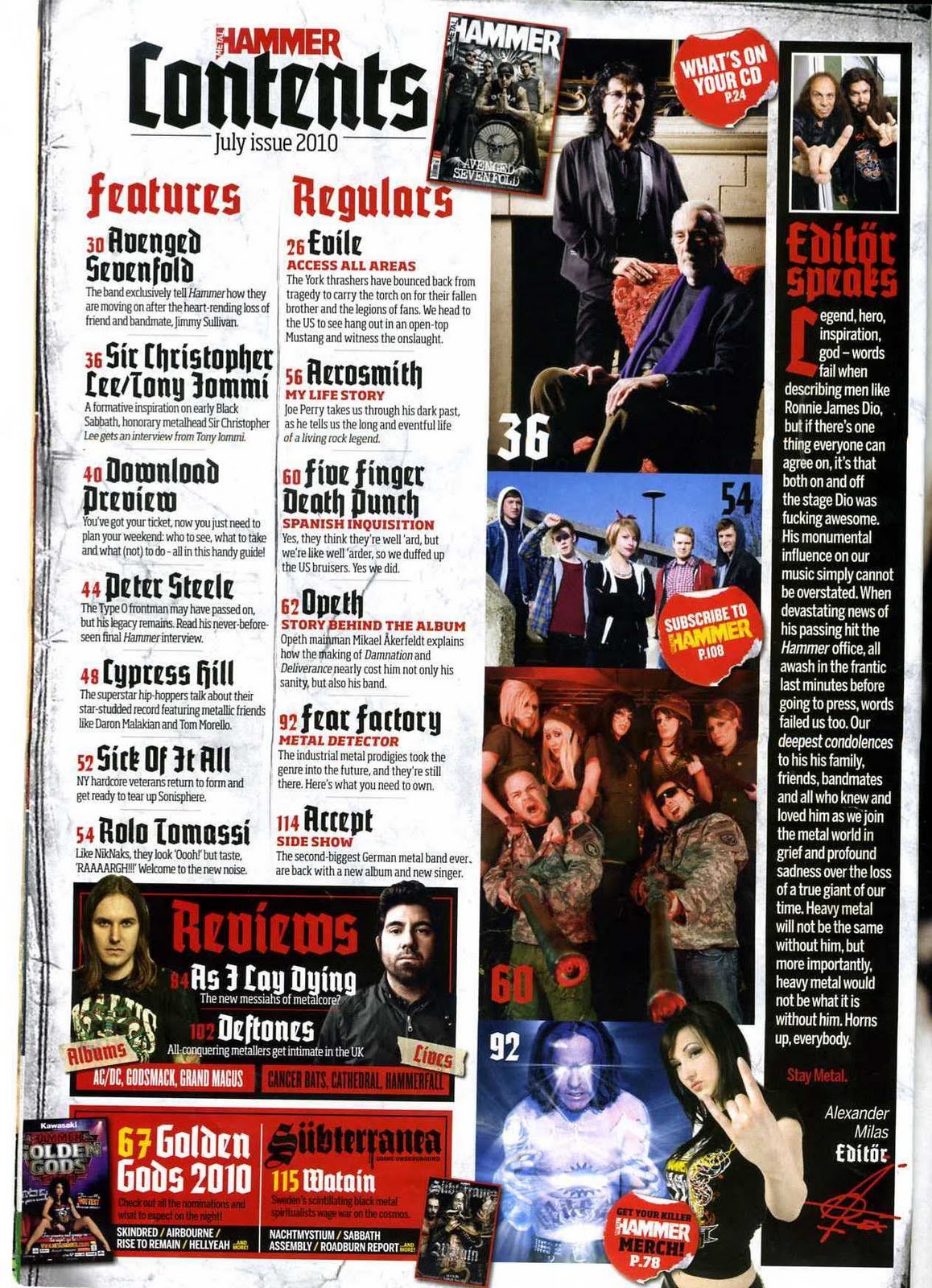
Metal Hammer MagazineMetal Hammers contents page is diffrent from other content pages because it does not start on the second page but on the 4th page. Between the cover and the contents there is advertisment and a tribute to a singer who had just recently passed away. The colours that you first see when you look at the contents page is mostly red and dark colours. The colour red usually symbalises blood and violence which usually Heavy Rock includes because of the lifestyle that Rock stars live. The Contents page is full of information and pictures. It is split into four diffrent catagories. There is the "Editor Speak", the page referances and then the pictures. The Editor Speak is placed on the right side of the contents page and the editor talks about the late Rock star Ronnie James Dio. The page refrences is split into three groups one being the features and the one being the regulars and the other being the reviews. The Features are the bands that are new and that may be becoming popular in the charts. The Regular list is for well known bands such as "Aerosmith" and other bands that have allready made a name for themselves. The review list is not as big as the other lists but it is there for people who would like to know about a band and what Metal Hammer think of some bands. There are Four prominant pictures. The top one shows rock legends Sir Christopher Lee and Tony Iommi with one being sat on a chair and one standing up. The Sir Christopher Lee is sat down maybe showing his age even though the reader will know that he had a good rock carrer but now he is in his elderly state. The second and third picture shows younger Rock singers and band memebers and then at the bottom there is a picture of man seemingly glowing. There are also other information on the contents page such as there are advertisments.

KERRANG Magazine
Kerrang Magazine has a diffrent way of laying out their contents page. If you look at the page as it is cut into sections you will see really it is really split up into two diffrent sub divisions. one being the top half which is a large photograph with oher photographs with information at the side of the large Photo. The bottom half has most of the information aboout what is going to be in the magazine and also it has a message from the Editor of the magazine. The main colours used in the Contents pages are red, black and yellow. The colours can be seen as a way of seeing where to look for the right information for example the words in Yellow are usually
Friday, 19 November 2010
Market Research on 3 Magazine front covers.

Background- KERRANG magazine was established in 1981 and is a rock magazine which is published by Bauer consumer media and is a British based magazine.
Language - This magazine also has all the typical conventions that a music should usually allways have such as theMagazine name this also reffered to as the Mast head. The mast head for this magazine is "Kerrang" it has a shattered affect assif it has been shattered from the volume of the music this could show that the type of music that this magazine represents is very loud and high pitched.. The Mast head is also covered by the picture but you can still work out that it is called KERRANG. The picture itself shows five band members all stood up all stood up in a order this may represent the hyrarcy of the band for example the person in the front could be the main singer. Also the picture shows the main person in the photo showing his Tattoo and Tattoos show' hardness and they are also assosiated with Rockstars and heavy metal and rock band members so this may be showing that he is part of a rock band. Even if you did not know who the band was you can tell who they are because the bands name has been placed right next to the picture and also you can tell where and what kind of music they represent though the Ancorage under the name "NORTHERN UPROAR" This maybe trying to say that they are having big sucsess up north in the United Kingdom and also the UPROAR almost sounds like a rebelious word showing that they are new and that they have a diffrent and new sound of music. Also at the top of the music magazine it has a hard hitting line " TRAVIS BARKER IN PLANE CRASH HORROR" people would see this and want to know the outcome of the Plane crash was and if people are Travis Barker fans they would want to know if he was ok so this intises people into reading the magazine. Free posters are also advertised on the front cover and everyone likes free stuff its just the British way of life. They advertise the posters by using three pictures of three diffrent singers/bands singing plus they have the singers/bands names underneath so that you know who they are.
The Magazine also has a Price tag because this shows how much the magazine is and what date the magazine is valid unitl.
Ideology- The Ideology behind Kerrang magazine is to represent Rock music in a new light showing it as fun and cool.
Institution- Kerrnag is published by Bauer Consumer Media Bauer is an institution which has aims of making magazines accomplish good selling.
Audience- The Audience for this magazine would be preferbly teenagers and people who would be intrested in Rock music.The price of this magazine which is £2.20 will allow teenagers to buy it with there pocket money or part time jobs.
Representation- The representation for Kerrang magazine is to show new and intersting new and allready well established Rock bands with information about bands and gigs.

Background- KERRANG magazine was established in 1981 and is a rock magazine which is published by Bauer consumer media and is a British based magazine.
Language - This magazine also has all the typical conventions that a music should usually allways have such as theMagazine name this also reffered to as the Mast head. The mast head for this magazine is "Kerrang" it has a shattered affect assif it has been shattered from the volume of the music this could show that the type of music that this magazine represents is very loud and high pitched.. The Mast head is also covered by the picture but you can still work out that it is called KERRANG. The picture itself shows five band members all stood up all stood up in a order this may represent the hyrarcy of the band for example the person in the front could be the main singer. Also the picture shows the main person in the photo showing his Tattoo and Tattoos show' hardness and they are also assosiated with Rockstars and heavy metal and rock band members so this may be showing that he is part of a rock band. Even if you did not know who the band was you can tell who they are because the bands name has been placed right next to the picture and also you can tell where and what kind of music they represent though the Ancorage under the name "NORTHERN UPROAR" This maybe trying to say that they are having big sucsess up north in the United Kingdom and also the UPROAR almost sounds like a rebelious word showing that they are new and that they have a diffrent and new sound of music. Also at the top of the music magazine it has a hard hitting line " TRAVIS BARKER IN PLANE CRASH HORROR" people would see this and want to know the outcome of the Plane crash was and if people are Travis Barker fans they would want to know if he was ok so this intises people into reading the magazine. Free posters are also advertised on the front cover and everyone likes free stuff its just the British way of life. They advertise the posters by using three pictures of three diffrent singers/bands singing plus they have the singers/bands names underneath so that you know who they are.
The Magazine also has a Price tag because this shows how much the magazine is and what date the magazine is valid unitl.
Ideology- The Ideology behind Kerrang magazine is to represent Rock music in a new and interesting way and making it easy to understand new music
Institution- Kerrnag is published by Bauer Consumer Media Bauer is an institution which has aims of making magazines accomplish good selling.
Audience- The Audience for this magazine would be preferbly teenagers and people who would be intrested in Rock music.The price of this magazine which is £2.20 will allow teenagers to buy it with there pocket money or part time jobs.
Representation- The representation for Kerrang magazine is to show new and intersting new and allready well established Rock bands with information about bands and gigs.

Background- Metal Hammer magazine is a heavy metal magazine which is published once a month in the united kingdom. It is the largest selling metal magazine in the UK.
Language- The language used for this Magazine can be seen with all the conventions of a typical music magazine for example Camera angle, Colour, Font , Point of view, Mast head, Photos, Price tag, Date and many more diffrent conventions. The Mast head is very unique because of what message it has to petray. Metal Hammer itself is a strong and powerful name for a music magazine. The word "Hammer" is made to look as if it has been painted or someone has Graffited on and also it has paint dripping down maybe showing it was done quick as a rebellius act maybe showing the music they support is a rebbelius sort of music. The picture shows four members from the band "Avenge sevenfold" which are a world renound heavy rock band. They pertray this by the way they dress and the props they use in the shoot they used for the front cover of the magazine. In the photo it shows the main band leader sat on what looks like a skull drum symbalising death and also power for the main singer because he has been brought forward in the picture. The other band members are stood behind the band member sat on the drum. Two of them are wearing sunglasses whilst one of them isnt this may show that they see darkness instead of light. The band members also seem to have lotts of tattoos on their arms. Tattoos symbalise power and status and also is linked to Rock band singers. This picture is most defonetly photoshoped you can tell this because of the background In the picture. One thing i noticed is that the Mast head is in darkness but near the bottom there is a horizen maybe symbolising a new dawn. The band member who is sat down is also is putting his palms together making it seem as though he is praying for something and postioned on the wall behind him is an angel but it does not look like an angelic angel which we all dipict as being one it is a male angel not female and its is in darkness and has black wings maybe trying to show a Rock Angel There is also a tag line with a quote from the band which reads "our first thought was .' It's over.' It isn't. This is how jimmy will live on" This quote would make people intrested in the magazine to find out what it may mean. The price tag is also on the magazine which allows people to see how much the magazine causes and also the date is on the magazine to allow the customer to see if the Magazine is relevant for that time.
Ideology-
Institution- Metal Hammer is owned by "Future" and they are a publishing business. they Integrate new media with magazine publishing, Metal Hammer brands capture the excitement of the fast-moving sectors they operate in, providing a direct line of communication to a wide audience, at a time when they are at their most involved and engaged.
Audience- The main audience for Metal hammer magazine would probally be for middle aged men this is because of the age of most of the men that are perseved in pictures and the advertisments in the magazines for example there is a full page in the magazine advertising sex lines and this is typically directed at single men there are also adds for Motorbikes and also Alcohol so it is not a magazine in which a minor or someone under the legal age of driving, Buying Alcohol or having sex should read. The price of the magazine also may pertray the type of person to buy the magazine because most people who don't have alot of money would not be able to afford £4.25 because this is a very steap selling price for your average teenager. The Magazine is a Heavy metal magazine so it would be ideal for someone who is into that sort of music.
Representation- Metal Hammer represents people that are into Heavy Rock and people who enjoy to learn more about Bands and also upcoming gigs and concerts.
Wednesday, 10 November 2010
LIIAR interpretatation of the Brief.
Language- Conventions used in Magazines usually consist of a Masthead, Cover stories and images. The images that are used in magazines are Medium-close up photo to show the person or the artist in the image more clearly and stands out more. Also the genre of the magazine will change the characteristics of the magazine for example a pop music magazine would have colourful bright colours whilst a Rock magazine would have dark colours this is a contrast between music magazines and also you can tell the difference between a rock magazine and a pop magazine just by the colours on the front cover.
Institution- My institution for my magazine will be ANP Magazines Limited.
Ideology- This is what the institution wants to get across and portray such as information and also what they represent . With a music magazine it may represent a different social music group for example Indie rock this type of music would be in a magazine such as NME. For another example Q magazine will represents Quality and this is what some readers may want this would target older readers or maybe younger students.
Audience- This is who the Magazine is targeted at and different groups in society for example Age, Gender, Income, Genre of music and social status these can all affect who would buy a certain magazine.
Representation- This ties in with Audience this is who the magazine represent such as age and sex for example you usually would not get a 13 year old pop loving girl reading Metal hammer because it does not represent her but a magazine such as Top of the pop's.
Institution- My institution for my magazine will be ANP Magazines Limited.
Ideology- This is what the institution wants to get across and portray such as information and also what they represent . With a music magazine it may represent a different social music group for example Indie rock this type of music would be in a magazine such as NME. For another example Q magazine will represents Quality and this is what some readers may want this would target older readers or maybe younger students.
Audience- This is who the Magazine is targeted at and different groups in society for example Age, Gender, Income, Genre of music and social status these can all affect who would buy a certain magazine.
Representation- This ties in with Audience this is who the magazine represent such as age and sex for example you usually would not get a 13 year old pop loving girl reading Metal hammer because it does not represent her but a magazine such as Top of the pop's.
The Brief for the Main task
The front page, contents and a double page spread of a new music magazine. All images and text used must be original, Produced by you- Minimum of four images.
Thursday, 28 October 2010
Evaluation on the College Magazine
I was asked to produce the front page of a new school/college magazine, featuring a photograph of a student in medium close-ups plus some appropriately laid-out text and master head Using DTP and also create a mock up of the Contents page to demonstrate their grasps of DTP.
First of all I did a LIIAR evaluation on a college magazine to get an idea on what my college magazine was like so I looked at two different college magazines to get an idea on how to make and what to use in my college magazine. Doing this I found out I needed things such as a Master head, Anchorage , pictures, an institution, a target audience, a format and many other important things that would make it a Magazine.
After this I then went on to planning my magazine I realised there were Lott's of different parts of college life and subjects that i could focus my college magazine on from Science, sport, cooking to Studying and many other different aspects of college life so I had Lott's of different things to choose from. I thought studying and revising would be a good choice because it affects everyone at college because everyone has to do some form of revision or studying. The reason why I decided to call my magazine Studying and Revision at Wyke college was because the Audience would know straight away what the magazine will be about. My target audience was students aged 16-19 for them to overcome stresses and problems they where facing.
After doing all my research and part of my planning I then went onto taking my photos for the Front cover of the magazine. I needed my photos to be a medium close-up and also to show someone studying or revising depending on the interpretation of the reader. I then picked my model who was happy to go ahead with the shoot. We then went to the Library in the college and took some books for example a book called "World War" to show knowledge and interest and also some people think of revision as a battle so that was one of the reasons why I wanted to get this book in my shot. When i took the picture I was stood on a chair and I then asked her to look up with a slight smile so this would give the impression as though she was at a vulnerable time in her academic life but she was in control and and had the power. The colours in the picture are also calm and neutral showing that she is in a comfortable and a nice working area so can study peacefully and independently.
After taking my photo I then planned my front cover and my contents page on an A4 piece of paper just to get an outline on what order and where to put my photos, Master head and other pieces of information.
I then started on making my magazine. I used Photo shop to to create my magazine and put my photo onto it and then used a text publisher to put my Master head and anchorage onto my magazine. I wanted to use bright colours to catch the audiences attention and placed the Master head just above my models head also i wanted it to be bold so it is clear to understand. The questions I used on my front cover was questions that where aimed at people that maybe worrying about exams and revision such as "Are you worrying about Exams? Find it hard to revise? These questions would make it seems as though the magazine is targeted at them and if they was thinking yes they would read the text below which says "Read this Magazine and it will give you tips and advice about everything you need to know" This entices people into reading the magazine to find out more. Also I used a photo of a bar code and edited it into my magazine to give it a professional look.
There are many things that I would change about my magazine because it was a bit of a rush near because I took more time thinking about the planning and taking the photos and was left with a short period of time near the end to take time and care in my Magazine. This affected my skills that I usually use on photo shop for example I would of made the text a bit more less bright for the ancourage at the bottom because it is hard to read and also I would of left a bit of room to the left of my photo for the Anchorage so it isn't in the way of the books in the picture. Overall in the time that I was given I believe it is presented good and also is up to standard of a college magazine.
First of all I did a LIIAR evaluation on a college magazine to get an idea on what my college magazine was like so I looked at two different college magazines to get an idea on how to make and what to use in my college magazine. Doing this I found out I needed things such as a Master head, Anchorage , pictures, an institution, a target audience, a format and many other important things that would make it a Magazine.
After this I then went on to planning my magazine I realised there were Lott's of different parts of college life and subjects that i could focus my college magazine on from Science, sport, cooking to Studying and many other different aspects of college life so I had Lott's of different things to choose from. I thought studying and revising would be a good choice because it affects everyone at college because everyone has to do some form of revision or studying. The reason why I decided to call my magazine Studying and Revision at Wyke college was because the Audience would know straight away what the magazine will be about. My target audience was students aged 16-19 for them to overcome stresses and problems they where facing.
After doing all my research and part of my planning I then went onto taking my photos for the Front cover of the magazine. I needed my photos to be a medium close-up and also to show someone studying or revising depending on the interpretation of the reader. I then picked my model who was happy to go ahead with the shoot. We then went to the Library in the college and took some books for example a book called "World War" to show knowledge and interest and also some people think of revision as a battle so that was one of the reasons why I wanted to get this book in my shot. When i took the picture I was stood on a chair and I then asked her to look up with a slight smile so this would give the impression as though she was at a vulnerable time in her academic life but she was in control and and had the power. The colours in the picture are also calm and neutral showing that she is in a comfortable and a nice working area so can study peacefully and independently.
After taking my photo I then planned my front cover and my contents page on an A4 piece of paper just to get an outline on what order and where to put my photos, Master head and other pieces of information.
I then started on making my magazine. I used Photo shop to to create my magazine and put my photo onto it and then used a text publisher to put my Master head and anchorage onto my magazine. I wanted to use bright colours to catch the audiences attention and placed the Master head just above my models head also i wanted it to be bold so it is clear to understand. The questions I used on my front cover was questions that where aimed at people that maybe worrying about exams and revision such as "Are you worrying about Exams? Find it hard to revise? These questions would make it seems as though the magazine is targeted at them and if they was thinking yes they would read the text below which says "Read this Magazine and it will give you tips and advice about everything you need to know" This entices people into reading the magazine to find out more. Also I used a photo of a bar code and edited it into my magazine to give it a professional look.
There are many things that I would change about my magazine because it was a bit of a rush near because I took more time thinking about the planning and taking the photos and was left with a short period of time near the end to take time and care in my Magazine. This affected my skills that I usually use on photo shop for example I would of made the text a bit more less bright for the ancourage at the bottom because it is hard to read and also I would of left a bit of room to the left of my photo for the Anchorage so it isn't in the way of the books in the picture. Overall in the time that I was given I believe it is presented good and also is up to standard of a college magazine.
Friday, 22 October 2010


Subscribe to:
Posts (Atom)