I was asked to produce the front page of a new school/college magazine, featuring a photograph of a student in medium close-ups plus some appropriately laid-out text and master head Using DTP and also create a mock up of the Contents page to demonstrate their grasps of DTP.
First of all I did a LIIAR evaluation on a college magazine to get an idea on what my college magazine was like so I looked at two different college magazines to get an idea on how to make and what to use in my college magazine. Doing this I found out I needed things such as a Master head, Anchorage , pictures, an institution, a target audience, a format and many other important things that would make it a Magazine.
After this I then went on to planning my magazine I realised there were Lott's of different parts of college life and subjects that i could focus my college magazine on from Science, sport, cooking to Studying and many other different aspects of college life so I had Lott's of different things to choose from. I thought studying and revising would be a good choice because it affects everyone at college because everyone has to do some form of revision or studying. The reason why I decided to call my magazine Studying and Revision at Wyke college was because the Audience would know straight away what the magazine will be about. My target audience was students aged 16-19 for them to overcome stresses and problems they where facing.
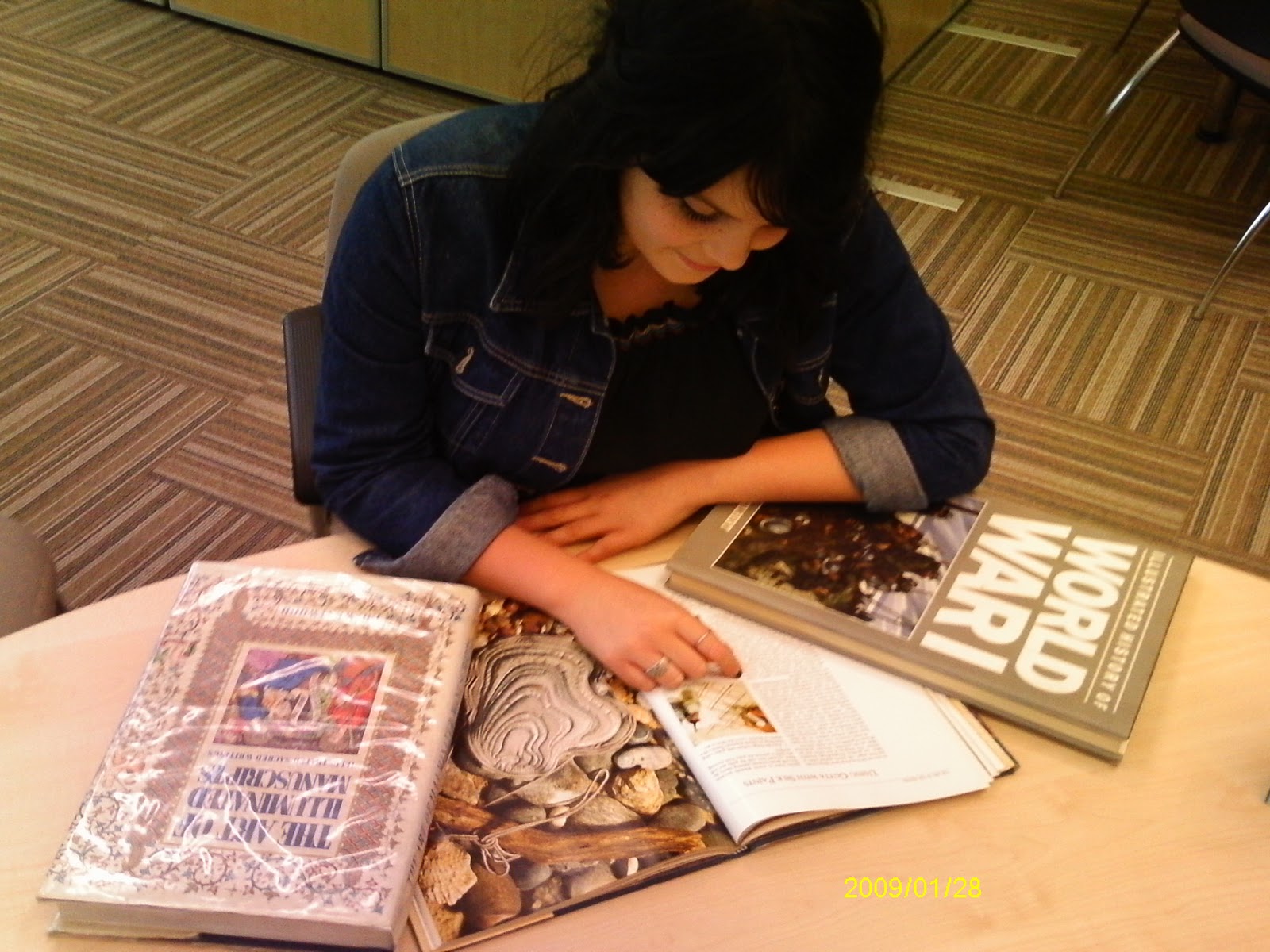
After doing all my research and part of my planning I then went onto taking my photos for the Front cover of the magazine. I needed my photos to be a medium close-up and also to show someone studying or revising depending on the interpretation of the reader. I then picked my model who was happy to go ahead with the shoot. We then went to the Library in the college and took some books for example a book called "World War" to show knowledge and interest and also some people think of revision as a battle so that was one of the reasons why I wanted to get this book in my shot. When i took the picture I was stood on a chair and I then asked her to look up with a slight smile so this would give the impression as though she was at a vulnerable time in her academic life but she was in control and and had the power. The colours in the picture are also calm and neutral showing that she is in a comfortable and a nice working area so can study peacefully and independently.
After taking my photo I then planned my front cover and my contents page on an A4 piece of paper just to get an outline on what order and where to put my photos, Master head and other pieces of information.
I then started on making my magazine. I used Photo shop to to create my magazine and put my photo onto it and then used a text publisher to put my Master head and anchorage onto my magazine. I wanted to use bright colours to catch the audiences attention and placed the Master head just above my models head also i wanted it to be bold so it is clear to understand. The questions I used on my front cover was questions that where aimed at people that maybe worrying about exams and revision such as "Are you worrying about Exams? Find it hard to revise? These questions would make it seems as though the magazine is targeted at them and if they was thinking yes they would read the text below which says "Read this Magazine and it will give you tips and advice about everything you need to know" This entices people into reading the magazine to find out more. Also I used a photo of a bar code and edited it into my magazine to give it a professional look.
There are many things that I would change about my magazine because it was a bit of a rush near because I took more time thinking about the planning and taking the photos and was left with a short period of time near the end to take time and care in my Magazine. This affected my skills that I usually use on photo shop for example I would of made the text a bit more less bright for the ancourage at the bottom because it is hard to read and also I would of left a bit of room to the left of my photo for the Anchorage so it isn't in the way of the books in the picture. Overall in the time that I was given I believe it is presented good and also is up to standard of a college magazine.
Thursday, 28 October 2010
Friday, 22 October 2010


Photos for ideas on my Magazine front cover

Wednesday, 20 October 2010
Planning and Ideas for My College Magazine.
There are many different types of college magazines that you can do for example there are different subjects and different parts of college life that can be talked about in a magazine or actually have its own magazine for example these are some subjects that i could focus on such as Sport, Art and design , Textiles, Science and Maths also there are many other subjects that i could focus my magazine on. Also i could do my magazine focusing on college life and studying for example studying, Exams and even just general new about the college. For this Task i am going to do a Magazine about studying at college and revising for exams because it is something that affects everyone in college and it would reach a large audience instead of it just been targeted on one subject inbeticular. I think the mid shot photo i am going to use is going to be of a student studying or revising for an exam. My Magazine will target students aged 16- 19 helping them to overcome the stresses of exams and how to or to help with coursework. For this i will need to choose a picture that will petray somebody studying and also it will have the relevent information. The master head for my magazine will be called studying and revision at Wyke college.
Second college Magazine Analysis
This Magazine is similar to the previous analysis that I did because it was published from the same institution so there are many similar characteristics.
LANGUAGE- The Master head is "Secondary Teachers" But this time it is blocked partially by the girl in the picture showing she has dominance and power. The date shows us that it was to be published for May 2009 this allows the reader to know that the college magazine is up to date and has the relevant information within the magazine. The picture is a mid shot of a sensibly dressed girl holding up a note pad and holding glasses preserving that she is an educational figure. Also it is good that the photo is a mid shot because it allows writing to be added down the side for information and teasers to what will be in the magazine. You can tell that the magazine is for a place of Education because you can tell this because as soon as you see the magazine because someone who words in the education such as a teacher would recognise it even with the word "Ofsted" Because schools are usually allways related to Ofsted in the news and also in schools all across the country.
INSTITUTION- The institution for this Magazine is "Secondary Education" this meens that it can be Mediated so then information can be put across but only what the institution wants you to see.
IDEOLOGY- As in before this magazine is there to inform and Educate. Also it shows that there is going to be a big change in inspections because where it says " Meet the new inspectors they're not from Ofsted" you can tell it is of importance because it has been circled out so it stands out so this could show about what the magazine could be about.
AUDIENCE- The Audeience for this Magazine is for teachers because non of the information on the front cover is relevant for children or parents but it is for teachers for example where it says "Whats YOUR staffroom like? this lets teachers know that it is a magazine directed at them.
REPRESENTATION- I beleive it represents students and how they can be shown as intelectuels and how they can assess teachers aswell as Ofsted.
Thursday, 14 October 2010
LIIAR analysis on two college Magazines

The master head is Secondary teachers and the "Secondary" allows you to know that it is for Teachers who teach in Secondary Teachers. The date shows us that it was for November 2007 this allows people to know if it is up to date and if the information inside is up to date. The picture shows a fingerprint and writing comes off talking about information about the pupils day showing that they can see what a pupil has been up to. Also there is a picture at the top showing a girl smiling showing that sharing her school with Pigs and Chickens is good. There is allot of information that is given on this front cover for example you know its for a place of education because it is written by the department for children , schools and families. Also above the Master head it talks about "How to survive parents evening" and also "Boost your career - abroad " This entices and interests teachers into reading the magazine.
The Main tag line is "Student ID How fingerprint recognition is reshaping the way schools work" this would interest teachers into finding out more about this Student ID and how it would reshape the ways schools work or most importantly how it would affect their way of teaching .
INSTITUTION - The institution for this magazine would be "Secondary Teachers" and this institution may try and portray school life as a place to work to behave because then teachers can see the seriousness of this. It can affect the final product because the magazine wants the reader to focus more on the student.
IDEOLOGY - To inform and educate and also it puts the idea across that everyone is different and students can be individuals. Also it portrays the day of a student at a school because it shows what time they was registered to what they had for lunch that day and even how much it cost.
AUDIENCE- The target audience for this Magazine is for Teachers in Secondary Education and it targets them because it is to do with there profession and to try and benefit them and to give advice. We can also tell this magazine is for teachers because it talks about "How to survive parents evening" and we know this is for teachers because it would not be appropriate information for a student or parents.
REPRESENTATION- It represents students and how student ID fingerprints can track students around the School it also can represent students in a bad way because it shows the need to know what pupils are up to because they use fingerprints in places such as in crime.
Wednesday, 13 October 2010
LIIAR On Interpretation Of The Brief
L- LANGUAGE
Masterhead, Date, Picture, Information, Tagline , Price, Date,
I - INSTITUTION
Wyke College
I- IDEOLOGY
To inform and Educate
A- AUDIENCE
Students and Teachers at the college and for pupils at schools who may want to come to the college.
R- REPRESENTATION
It will represent students, Teachers , life at the college and events.
Thursday, 7 October 2010
The Brief
Using DTP and an image manipulation program, Produce the front page of a new school/college magazine, featuring a photograph of a student in medium close-ups plus some appropriately laid-out text and master head. Additionally you must produce a mock-up of the layout of the contents page to demonstrate their grasps of DTP
Subscribe to:
Comments (Atom)