We were given a task to create the front page, contents and a double page spread for a new music magazine. The images and text used had to be original and produced by myself, and we were given a minimum of four images.
My media product uses and develops most forms and conventions of a real media product. This is done by placing things in a professional and conventional manner in which it fits in with the image of other well-known magazines. My front cover consists of an image, a masthead, price, barcode and other things you would expect to find on other magazines. It sticks with most of the conventions that would be found on other magazines but has its own twist on it for example, it does not have the price where a normal magazine would place its price code, as mine is at the top right hand corner because with the audience’s own knowledge of magazines, people read from top left downwards and in this economic climate people want to know how much a magazine costs before they would think about purchasing it. The Mast head is very bold and eye catching using a bright colour so when the consumer sees the product they would be able to tell straight away that this was the title for my magazine. It also has a different font to it so it gives it a new and original effect. The title "WTFK" stands for "What’s The Frequency Kenneth." Other than it being my name it was a song from a band and I thought this gave its own character and edge to my magazine. The picture I used for my magazine was a picture of Connor who was the main artist in my magazine with a featured interview and was continued through my magazine on the front cover, contents page and double page spread. Connor is holding a guitar and is placed behind a set of drums, I did this during my photo shoot as I wanted to show that he is a musician and the audience would be able to see this straight away. The lighting is bright and shows Connor’s face well so then the audience will be able to be easily recognised. I did not want the audience’s eye to be distracted by puffs and advertisements that would be normally shown on a magazine but in my audience research people said they did not wanted to be bombarded by advertisements so I took this on board. When I was in my planning stage of creating my magazine I wanted to create meaning for my product so when it came to colours I wanted continuity in my colours and this is why I chose two contrasting and eye catching colours. Symbolically Black and Red mean danger but the colour Red can also be seen as the colour for passion and I picked up on this as my magazine is both appealing to both male and female niche audiences. I wanted my product to be cheap as these economic times have hit my target audience hard. Also I have put the date of issue so people know which edition they are buying. When I was at my photo shoot I intentionally set out that I wanted my artist to be looking at the camera for my front cover as I wanted the audience to be able to have that connection with my artist and also I knew that I would need to leave space for my Mast head and other conventions that I have included and positioned.
My media product uses and develops most forms and conventions of a real media product. This is done by placing things in a professional and conventional manner in which it fits in with the image of other well-known magazines. My front cover consists of an image, a masthead, price, barcode and other things you would expect to find on other magazines. It sticks with most of the conventions that would be found on other magazines but has its own twist on it for example, it does not have the price where a normal magazine would place its price code, as mine is at the top right hand corner because with the audience’s own knowledge of magazines, people read from top left downwards and in this economic climate people want to know how much a magazine costs before they would think about purchasing it. The Mast head is very bold and eye catching using a bright colour so when the consumer sees the product they would be able to tell straight away that this was the title for my magazine. It also has a different font to it so it gives it a new and original effect. The title "WTFK" stands for "What’s The Frequency Kenneth." Other than it being my name it was a song from a band and I thought this gave its own character and edge to my magazine. The picture I used for my magazine was a picture of Connor who was the main artist in my magazine with a featured interview and was continued through my magazine on the front cover, contents page and double page spread. Connor is holding a guitar and is placed behind a set of drums, I did this during my photo shoot as I wanted to show that he is a musician and the audience would be able to see this straight away. The lighting is bright and shows Connor’s face well so then the audience will be able to be easily recognised. I did not want the audience’s eye to be distracted by puffs and advertisements that would be normally shown on a magazine but in my audience research people said they did not wanted to be bombarded by advertisements so I took this on board. When I was in my planning stage of creating my magazine I wanted to create meaning for my product so when it came to colours I wanted continuity in my colours and this is why I chose two contrasting and eye catching colours. Symbolically Black and Red mean danger but the colour Red can also be seen as the colour for passion and I picked up on this as my magazine is both appealing to both male and female niche audiences. I wanted my product to be cheap as these economic times have hit my target audience hard. Also I have put the date of issue so people know which edition they are buying. When I was at my photo shoot I intentionally set out that I wanted my artist to be looking at the camera for my front cover as I wanted the audience to be able to have that connection with my artist and also I knew that I would need to leave space for my Mast head and other conventions that I have included and positioned.
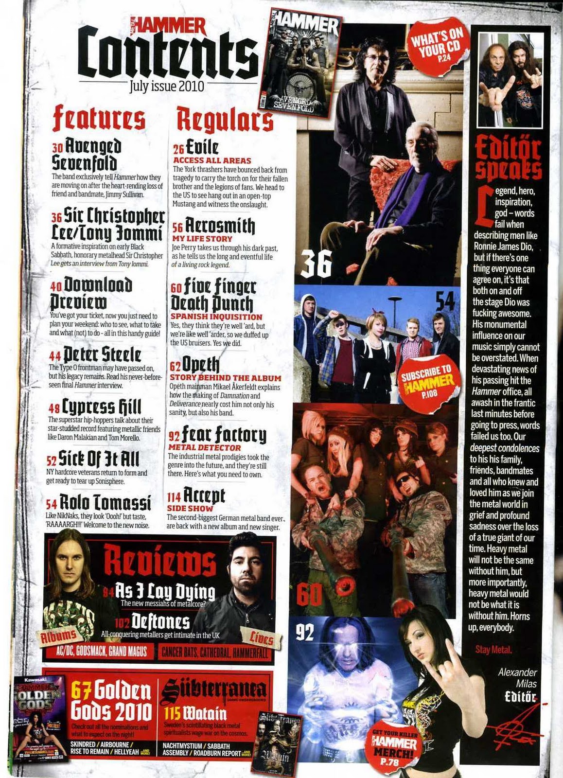
My Contents page also has the normal conventions of a regular contents page but is different and unique to its rival magazines which are at competition with each other. It has the name of the magazine at the top so then it reminds the audience all the way though that you are reading something from WTFK. This is due to my plan for having continuity throughout the magazine. It has the Masthead stating "Contents." This helps people know that it is the contents page and also I used a large red font so it stands out from everything else other than the WTFK which needs to be larger as it is more important. There is an Editors letter on my contents page which is usually seen in other successful magazines. It also does not take up a lot of room but is visible to the reader and they will automatically know that the article is an editor’s letter because other magazines place there editors message in the same place as were I positioned my editors message. She talks about the main artist in the magazine which is Connor and she talks about how she enjoys his music and also has a friendly and approving approach to Connor and his music, this could be used to help Connor gain popularity and also the reader will be able see that if the editor is writing about him that he must be good. There is also a picture to the left of the Editors letter and it shows a coloured close up shot of Emily who is the editor of the magazine and who had wrote the editor’s letter the left of the Editors letter. This also helps the reader to put a face to the editor so then people feel as though they have that sense of communication between the Editor and reader. The list of pages is featured into two different categories being "Featured pages" and the other being "Regulars" this lets the audience know who is usually in the magazine and who is a special feature and this would make the audience want to know what it is. Also the colour used changes between the both and is reversed to give the opposite affect to each other. The picture I used for my Contents page was a picture i took in the Piano room in college which was a well lit room and was facing away from the window so then it would give it a really inspiring look to it. The picture shows Connor playing the Piano as he is bent down and really feeling the music. I cropped the photo so then you would only really see Connor and the piano, this created meaning to the reader and shows the intimate moment of Connor and the Piano, I also took pictures of another artist so my contents page would look fuller and more professional as people do not want a magazine just to consist of one artist so with having another artist appear in the Contents page it looks like there is more than one artist in the magazine, The photo is natural and shows Faran holding a guitar, this showing that she is musical talent and that she will also be in the magazine. I positioned my Contents page in a specific way which stuck by the conventions of a normal magazines contents page, I wanted it to be simple so the reader will easily be able to understand it and also look professional and unique.
My Double page spread also has the characteristics of a well-known magazine because the layout is similar to other magazines and also there is a clear divide down the page. On the left page you see is dominated by the photo and also the name of the artist "Connor Hodgins”. This allows people to know that it is the article that had been advertised on the front cover and on the contents page. The photo is a dark photo but a powerful photo to use because it shows Connor working on a Sound system, when I was planning for my shoot I wanted somewhere where they use digital sound systems so when I went to go and view the shooting area I straight way knew that the studio would be great for my shoot. It was in a dark room but this showing that this is was all the music is created and how he puts all of his knowledge and energy into editing and creating his songs. The photo also goes along with the caption which says “Behind the Desk with Connor” this connotes the fact that you are seeing a side to Connor which most people do not usually see an artist when they are producing the music so this could start to build up a relationship between the reader and artist. There is an introduction to the interview at the right side of the double page spread masthead and there is a quote from the interview, big music magazine companies use quotes because it has catches the eye of the reader and also allows them to see what he will be talking about in the article because when it says "I'M ENJOYINGALL THE ATTENTION FROM THE GIRLS" I used this quote because the target audience of m magazine is teens and I target my magazine at having a 50/50% male and female to I targeted into the Narcism because boys would want to be him and girls would want to be with him, also it has a cheeky element to it. On the right hand of the page is the actual interview and two headings. The first heading says "Behind the desk with Connor" this has two meanings to it and how it is interpreted by the reader because when creating a magazine it is all about creating meaning. If you look at the photo you are behind the desk looking at Connor and also this can related to finding out a bit about Connor and finding out what happens behind that desk. The interview is laid out in columns so it looks professional and also in order, this helps the reader to read the article and be able to see who is asking the questions. I wanted the interview to have an informal and a friendlier approach to the interview so Connor would be able to seem as though a funny, cheeky and sociable character. There also is a caption at the bottom of the double page spread saying what the double page spread is about. The double page spread is also set out in the normal format for a double page.
My Double page spread also has the characteristics of a well-known magazine because the layout is similar to other magazines and also there is a clear divide down the page. On the left page you see is dominated by the photo and also the name of the artist "Connor Hodgins”. This allows people to know that it is the article that had been advertised on the front cover and on the contents page. The photo is a dark photo but a powerful photo to use because it shows Connor working on a Sound system, when I was planning for my shoot I wanted somewhere where they use digital sound systems so when I went to go and view the shooting area I straight way knew that the studio would be great for my shoot. It was in a dark room but this showing that this is was all the music is created and how he puts all of his knowledge and energy into editing and creating his songs. The photo also goes along with the caption which says “Behind the Desk with Connor” this connotes the fact that you are seeing a side to Connor which most people do not usually see an artist when they are producing the music so this could start to build up a relationship between the reader and artist. There is an introduction to the interview at the right side of the double page spread masthead and there is a quote from the interview, big music magazine companies use quotes because it has catches the eye of the reader and also allows them to see what he will be talking about in the article because when it says "I'M ENJOYING
Producing this magazine has developed my knowledge of both the practical and creative side of Media. I have gained valuable knowledge about how to produce and create a magazine and also learn a lot of terminology about Media which I did not know about before creating the magazine. Though the use of different forms of digital technology. The different forms of digital technology that I used to create my Magazine were Blogger, cameras and Photoshop. Using these I could produce and develop my skills in many ways such as, how to use these forms of digital technologies and how to use them in a constructive and productive way to produce my final products. Blogger was the first thing I was introduced to. It allowed me to put all of my ideas, Planning, essays, photos, videos, scanning work and final products onto the blog. Blogger enabled to put all my ideas together and to make a final decision on what I wanted to do. It allowed me to look back and piece together all of the posts that I made to produce and piece everything together. Blogger helped me develop my skills on how to structure, clearly show my workings out and show it all in chronological order. When I took my photos I could easily upload my photos onto the blog and analyse each photo and write a descriptive analyse of each photo below the photo. It was also good for when I needed to upload videos to do the LIIAR analysis. Blogger allows you to upload photos so this allowed me to scan things into the computer then publish them onto my blog. Blogger helped me develop my skills and by the end of the year I was confident about using Blogger and knew how to work it and structure my work clearly.
To make the magazines we needed photos and to take the photos we used the Vivitar 8 megapixel cameras. Using the camera was quite difficult at first but I soon learnt how to use it. It took me a couple of photos to get the pictures I wanted and learnt different techniques on how to take the photo. I learnt how to change the camera settings to make the camera turn black and white to very colourful. Shooting was very easy and different kind of shots gave the photos different affects such as tilting the camera slightly to create an edge of uneasiness and disorientation. After taking the photos I then uploaded them onto my blog and then could start to Photoshop them. Photoshop was a great help and allowed me to make my pictures better and edit things out that I don't want in my picture such as red eyes, Backgrounds and also things that did not fit in the scene. Once I had gotten rid of everything in the photo that I did not want, I then went on to add things to the photo which I though was appropriate such as extra lighting or making the scene darker. After making changes to the photos I then could develop my skills that I had learnt in class and though demonstrations by the teachers to start to construct my magazine. From using the scanner I knew exactly where I wanted things to go in my magazine so I knew what parts of my picture would be covered. Most of my pictures were quite central so I did not have this problem. I then could edit in backgrounds and effects to the magazine. I used the codes of conventions in my magazine so this had an effect on my decision making because I needed to my magazine not to look identical but have the similarities of other magazines such as a front cover with a Masthead. All the way though producing my magazine I had to think of how the use of Digital technologies could help me with my decision making as I knew that I could always improve on my work with the skills I had learnt with Blogger, cameras and Photoshop. Overall I am happy with the final product and looking back throughout my posts and my work I have seen clear signs of progress and feel more confident about using different forms of digital technology and know-how using it will help to create a better product.
To make the magazines we needed photos and to take the photos we used the Vivitar 8 megapixel cameras. Using the camera was quite difficult at first but I soon learnt how to use it. It took me a couple of photos to get the pictures I wanted and learnt different techniques on how to take the photo. I learnt how to change the camera settings to make the camera turn black and white to very colourful. Shooting was very easy and different kind of shots gave the photos different affects such as tilting the camera slightly to create an edge of uneasiness and disorientation. After taking the photos I then uploaded them onto my blog and then could start to Photoshop them. Photoshop was a great help and allowed me to make my pictures better and edit things out that I don't want in my picture such as red eyes, Backgrounds and also things that did not fit in the scene. Once I had gotten rid of everything in the photo that I did not want, I then went on to add things to the photo which I though was appropriate such as extra lighting or making the scene darker. After making changes to the photos I then could develop my skills that I had learnt in class and though demonstrations by the teachers to start to construct my magazine. From using the scanner I knew exactly where I wanted things to go in my magazine so I knew what parts of my picture would be covered. Most of my pictures were quite central so I did not have this problem. I then could edit in backgrounds and effects to the magazine. I used the codes of conventions in my magazine so this had an effect on my decision making because I needed to my magazine not to look identical but have the similarities of other magazines such as a front cover with a Masthead. All the way though producing my magazine I had to think of how the use of Digital technologies could help me with my decision making as I knew that I could always improve on my work with the skills I had learnt with Blogger, cameras and Photoshop. Overall I am happy with the final product and looking back throughout my posts and my work I have seen clear signs of progress and feel more confident about using different forms of digital technology and know-how using it will help to create a better product.


